Case Study Instructions:
- Look at this data and start thinking. List down 3 trends/points that you think need to be shown:
bigquery-public-data.thelook_ecommerce.ordersbigquery-public-data.thelook_ecommerce.order_itemsbigquery-public-data.thelook_ecommerce.usersbigquery-public-data.thelook_ecommerce.products
- From here, try to explore the data and make changes, filter, and prepare the data that you need.
- Create some visualizations or dashboard with the best type of chart that you have learned. You could use any tools as you wish.
- Then, make 1-2 slides from the graphs with the insights you got to present your findings to the stakeholders
List down 3 trends/points and create some visualizations or dashboard with the best type of chart that you have learned.
| Study Case Roadmap - Ask |
|---|
| Guidance Question: |
| Key Tasks: |
| Result |
The data required available in BigQuery Public Data marketplace. This service is included in free Google BigQuery account, so this can be accessed directly in BigQuery without other preparing methods. The Look e-Commerce is a fictitious company developed by Google Looker team. Furthermore, the contents of this dataset are fully synthetic.
Dataset contains detail information about customers, products, orders, logistics, web events, and digital marketing campaigns. Speaking of credibility, since this is a primary source data, the data consider as credible. As mentioned before, this dataset contains detail information about customers such as name, age, gender, and address; privacy aspect must be regulated more strictly. In conclusion, this dataset is well-formatted.
Details on data type for each table shown below:
| # | Field | Data Type |
|---|---|---|
| 1. | order_id | INT |
| 2. | user_id | INT |
| 3. | status | STRING |
| 4. | gender | STRING |
| 5. | created_at | DATETIME |
| 6. | returned_at | DATETIME |
| 7. | shipped_at | DATETIME |
| 8. | delivered_at | DATETIME |
| 9. | num_of_item | INT |
| # | Field | Data Type |
|---|---|---|
| 1. | id | INT |
| 2. | order_id | INT |
| 3. | user_id | INT |
| 4. | product_id | INT |
| 5. | inventory_item_id | INT |
| 6. | status | STRING |
| 7. | created_at | DATETIME |
| 8. | shipped_at | DATETIME |
| 9. | delivered_at | DATETIME |
| 10. | returned_at | DATETIME |
| 11. | sale_of_price | FLOAT |
| # | Field | Data Type |
|---|---|---|
| 1. | id | INT |
| 2. | first_name | STRING |
| 3. | last_name | STRING |
| 4. | STRING | |
| 5. | age | INT |
| 6. | gender | STRING |
| 7. | state | STRING |
| 8. | street_address | STRING |
| 9. | postal_code | STRING |
| 10. | city | STRING |
| 11. | country | STRING |
| 12. | latitude | FLOAT |
| 13. | longitude | FLOAT |
| 14. | traffic_source | STRING |
| 15. | created_at | DATE |
| # | Field | Data Type |
|---|---|---|
| 1. | id | INT |
| 2. | cost | INT |
| 3. | category | STRING |
| 4. | name | STRING |
| 5. | brand | STRING |
| 6. | retail_price | FLOAT |
| 7. | department | STRING |
| 8. | sku | STRING |
| 9. | distribution_center_id | INT |
| Study Case Roadmap - Prepare |
|---|
Guidance Question:
|
Key Tasks:
|
This analysis mainly use BigQuery as cloud storage database and Looker Studio as analyzing and visualizing data tools.
Since the data was available in BigQuery Public Data marketplace, I ran SQL scripts in BigQuery cloud console. First step I did was check for duplications, to do that I ran this scripts:
SELECT
    COUNT([column]) - COUNT(DISTINCT [column]) as dup
FROM
    `bigquery-public-data.thelook_ecommerce.[table_name]` as [alias];
The result was zero in all four tables. It means there were not any duplications in the table. Then I wanted to check if there was null value in the table using this script:
SELECT * FROM bigquery-public-data.thelook_ecommerce.[table_name]
WHERE
    [column_1] IS NULL OR
    [column_2] IS NULL OR
    ...;
The result was also zero, meaning that there is no null value in the table. The last step is checking the data consistency. To do this, I ran the SQL script below:
/* 1. CHECKING ID LENGTH DATA. SINCE THE ID DATA TYPE WAS INT64,
I NEEDED TO CONVERT THE DATA TYPE INTO STRING FIRST. */
SELECT DISTINCT
    LENGTH(CAST([id_column] as STRING)) as len_id
FROM
    `bigquery-public-data.thelook_ecommerce.[table_name]`

/* 2. CHECK FOR CITY, STATE, AND COUNTRY CONSISTENCY*/
SELECT DISTINCT
    [strColumnName]
FROM
    `bigquery-public-data.thelook_ecommerce.[table_name]`
All data seemed to be cleaned. There were not any duplications, misspelling, or null values. But there were two different countries naming as seen in the table below:
| # | Country Name | English Naming |
|---|---|---|
| 1. | España | Spain |
| 2. | Deutschland | Germany |
Since the dataset cannot be modified (due to limitation and restriction condition by BigQuery), I made a temporary table using WITH AS() statement to modify those country naming into the proper one using CASE statement.
WITH users_cl AS (
    SELECT CASE
        WHEN country = "España" THEN country = "Spain"
        WHEN country = "Deutschland" THEN country = "Germany"
    ELSE users_cl END
)
As a part of data cleaning processes, I checked the email data in users table using SQL script below. The result is email data completely clean.
  WITH user_temp AS (
    SELECT
      id,
      first_name,
      last_name,
      email
    FROM
      `bigquery-public-data.thelook_ecommerce.users`
  )
  SELECT
    id,
    first_name,
    last_name,
    email,
    REGEXP_EXTRACT(email, r'^(.*?)@') as name,
    LEFT(REGEXP_EXTRACT(email, r'^(.*?)@'), LENGTH(first_name)) as surname,
    RIGHT(REGEXP_EXTRACT(email, r'^(.*?)@'), LENGTH(last_name)) as fam_nam,
    REGEXP_EXTRACT(email, r'[.@](.*?)\.') as comp,
    RIGHT(email, 3) as dom
  FROM
    user_temp
  LIMIT 10;

  /* 'comp' STANDS FOR "COMPANY" AND 'dom' STANDS FOR "DOMAIN" */
EXPLANATION: REGEXP_EXTRACT() is regular expression that BigQuery provided in their built-in functions. This function match the substring with regular expression pattern. Example, when I extracted 'name' in email fields the regex can be interpretated as: "Matching any character at the beginning of the string (^) before the '@' symbol."
| Case Study Roadmap - Process |
|---|
Guiding questions:
|
Key tasks:
|
I utilized Looker Studio as the analyze tool. But, since Looker Studio can not directly manipulate tables in the dataset (like Power Query in Power BI), I need to query all data required by connecting BigQuery to Looker Studio using custom query connection feature. Therefore, I need to write individual SQL scripts to perform all analysis I wanted to do.

SELECT DISTINCT
  users.id,
  users.gender
FROM
  bigquery-public-data.thelook_ecommerce.users as users
ORDER BY
  users.id ASC;
I used the COUNT() function in Looker Studio to count total distinct users. Then, sorted it by gender; I copied the total users card and filtered the data for each gender. The results is that our active users were 100,000 people, with almost 50:50 ratio for gender distribution. After that, I wanted explore our users age range to see which one was dominating. Therefore, to make the age range and gender distribution chart, I write the scripts like this:
WITH age_group AS (
  SELECT users.age,
    CASE WHEN users.age>=12 AND users.age<=17 THEN '12-17'
         WHEN users.age>=18 AND users.age<=24 THEN '18-24'
         WHEN users.age>=25 AND users.age<=34 THEN '25-34'
         WHEN users.age>=35 AND users.age<=44 THEN '35-44'
         WHEN users.age>=45 AND users.age<=54 THEN '45-54'
  		 WHEN users.age>=55 AND users.age<=64 THEN '55-64'
         ELSE '>65' END as age_groups, users.gender as gender
  FROM bigquery-public-data.thelook_ecommerce.users as users
)
SELECT  age_groups,
        COUNT(*) as total,
        gender,
	    CASE WHEN gender = 'F' THEN 'Female'
            ELSE 'Male' END as genders
FROM age_group
GROUP BY age_groups, gender;
The age classification followed the age categories used by several govermental organizations which categorize age range from teenagers, youngs, young adults, adults, to seniors. This classification needed as a consideration of users buying power and other psychological aspects. The result shows that four groups of adults with range of age from 25 to 64 dominating 67.85 percent of our total users. Each group of age has 50:50 gender ratio (the difference was not significant). According to this, our users dominated by they who had stable income. This may also describe that products we sold are matched with adults preferences.
After knowing the users distribution, I wanted to know how our users growth was. Since the analysis was done in September 2022, the latest complete data was in September, too. To create the visualization, I write a custom query like this:
SELECT
  id as users_id,
  gender,
  created_at
FROM bigquery-public-data.thelook_ecommerce.users
ORDER BY 1;
From the users table, I extracted the created_at column which contained when was the user register an account in our website. In Looker Studio, I used COUNTDISTINCT() function to count how much total distinct users, breakdown the gender using gender field, and then extract month and year data from created_at field. This would count total users joined our website in a year. The result shows that the last we have an increasing number of users was on the 2019-2020 period, then it went plateau on 2020-2021 period, then it went down from 2021 to September 2022.
But if we breakdown for female line, the decreasing occured on 2020-2021 period, then went up again on 2021-2022 before going totally down in 2022. This finding indicates that we need to build a strategy to regain our users and traffic to maintain our business.
Now, I wanted know what traffic they used to get into our website. To do this, I ran script like this:
WITH tg AS (
  SELECT users.traffic_source as traffic,
    CASE WHEN users.traffic_source = 'search' THEN 'Search'
         WHEN users.traffic_source = 'organic' THEN 'Organic'
         WHEN users.traffic_source = 'facebook' THEN 'Facebook'
         WHEN users.traffic_source = 'display' THEN 'Display'
         WHEN users.traffic_source = 'email' THEN 'Email'
         ELSE users.traffic_source END AS traffic_groups
  FROM bigquery-public-data.thelook_ecommerce.users as users
)
SELECT  traffic_groups,
        COUNT(*) AS Total
FROM tg
GROUP BY traffic_groups;
I plotted in a pie chart to see a clearly distinctive result. It turns out that most of users know our website by searching it in any search engine. It followed by organic users, Facebook, email, and display. This suggests us to maintain and improve our current SEO or SEM strategy. However, we can not overlook the other traffics. This can also suggests us to improve our branding to attract more organic users, improve our ads and marketing strategy in Facebook Ads, email marketing, or displays. In other word, we need to improve the accessibility and users recognition to our business.
Lastly, I wanted to know where are they come from, does our users consisted only by local or domestic users or not. To do this, I ran a SQL script like this:
WITH country_group AS (
  SELECT users.country,
    CASE WHEN users.country = 'United States' THEN 'US'
         WHEN users.country = 'South Korea' THEN 'S.Korea'
         WHEN users.country = 'United Kingdom' THEN 'UK'
         WHEN users.country = 'España' THEN 'Spain'
         WHEN users.country = 'Deutschland' THEN 'Germany'
         ELSE users.country END AS country_groups
    FROM bigquery-public-data.thelook_ecommerce.users as users
)
SELECT country_groups, COUNT(*) AS TOTAL
FROM country_group
GROUP BY country_groups
As mentioned in the cleaning process previously, there were two country name data that did not follow the official naming. I used the temp table made in cleaning process and extended it with a few country to make it shorter to increase the readability. I plotted it into a vertical bar chart. The result is surprising, top three countries our users from are China, US, and Brasil; which leads by China with 11,000 more people than US. It means that our products are fulfilled both domestic and international needing. This findings also tells us to improve international recognition, because we have a great potential to extend our market.
/* 1. COMPLETE ORDER */
SELECT
  orders.order_id,
  orders.delivered_at
FROM  bigquery-public-data.thelook_ecommerce.orders as orders
WHERE orders.status = 'Complete';
/* 2. GROSS SALES AND AVERAGE SALES */
SELECT
  items.order_id,
  items.user_id,
  items.delivered_at as delivered,
  orders.gender,
  SUM(orders.num_of_item * items.sale_price) as order_revenue
FROM bigquery-public-data.thelook_ecommerce.orders as orders
INNER JOIN bigquery-public-data.thelook_ecommerce.order_items as items
ON items.order_id = orders.order_id
WHERE items.status = 'Complete'
GROUP BY 1,2,3,4;
/* 3. PROFIT */
SELECT
  items.order_id,
  items.user_id,
  orders.gender,
  items.status,
  items.product_id,
  items.delivered_at as delivered,
  products.cost,
  products.retail_price,
  items.sale_price,
  orders.num_of_item as num_item,
  ROUND(products.retail_price, 0) - ROUND(products.cost, 0) as profit,
  ((ROUND(products.retail_price, 0) - ROUND(products.cost, 0))/products.cost) as percent_profit,
FROM bigquery-public-data.thelook_ecommerce.order_items as items
INNER JOIN bigquery-public-data.thelook_ecommerce.products as products
    ON items.product_id = products.id
INNER JOIN bigquery-public-data.thelook_ecommerce.orders as orders
    ON items.order_id = orders.order_id
WHERE items.status ='Complete'
ORDER BY 1,2 ASC;
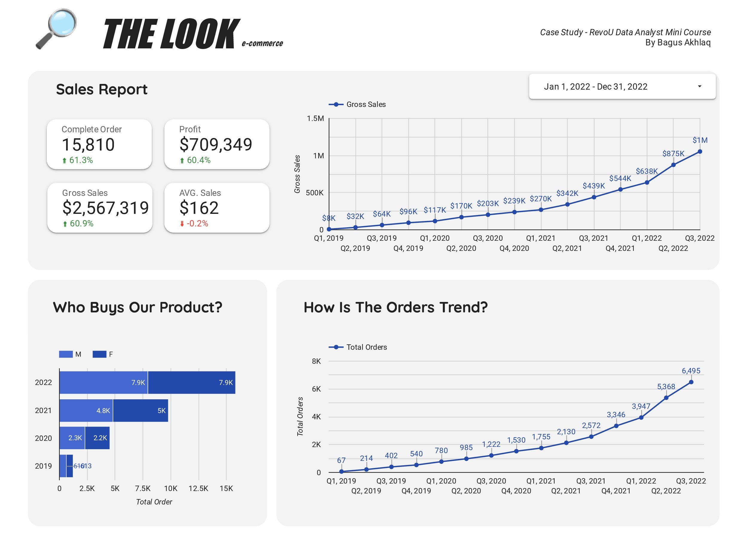
All these cards are linked to the date range control dropdown that can be seen on the right above of the sales trend chart. The date range control only controlled the cards and not the other visualizations.
I only aggregated complete orders data and excluded cancellations and returns to gain the succesful sales data. That was why the complete orders was only 15,810 orders from January to September 2022, which was only 1,757 average orders per month or 58-59 average orders per day. Even though, the total complete orders was increasing 61.3% compared to the same period of time in year 2021. Through the third quarter of 2022, the gross sales was $2,567,319 with profit $709,349. These numbers increasing 60% compared to the same period of time last year.
To clarify, the term 'gross sales' in this analysis refers to revenue (net sales) and term 'profit' refers to gross profit which only substract the revenue with cost of goods sold (CoGS) and not the fixed cost.
The equation above shows that our profit margin was 27.6 percent. This number must be compared to the national average number or our competitor's number for the same industry to get a comprehensive interpretation. Average sales per complete orders through the third quarter of 2022 was $162, 0.2 percent lower than last year, but it was not significant.
To make the sales trends visualization, I used the same Gross Sales SQL script like in the previous total gross sales card visualizations. This time, I plotted it into a line chart by filtering the date into four quarters in a year. As seen in the chart, our gross sales was constantly growing up. Until it reached the highest sales in Q1 to Q2 on year 2022. There was an increase in gross sales (total revenue) of 237,000 USD in the period of first and second quarter of 2022, or 37 percent increase from the first quarter. This number touched the all-time high revenue from 2019 to 2022.
The same SQL script (Gross Sales SQL script) also used to analyze the orders trend. Orders trend was useful to explain why there was an increase of gross profit beside the possibility of the increase of users buying power. I plotted the data into a line chart like before, but I use COUNT() function to the order_id field instead as the parameter. The result was clear, in the same period (Q1 to Q2 of 2022) the total order went to the all-time high with an increase of 1,421 orders. It can conclude that the more frequent our users buy products from us, the more we get total revenue. However, other factors like buying volumes, may also effect the sales we get.
Finally, still using the same SQL script, I plotted the data into a vertical stacked bar chart to see which buyers/users order our products more frequently. The result is surprisingly equalled. The ratio is constantly 50:50 between male and female users through 2019 to 2022. Total order numbers could grow until two-times each year, except for 2022 (total order numbers growed for 50 percent). This findings may indicates that our products always cover both genders segmentation.

SELECT
  orders.order_id,
  products.category,
  products.brand,
  products.name,
  items.delivered_at,
  orders.gender,
  SUM(ROUND(items.sale_price, 0)) as total_sales,
  SUM(ROUND(products.retail_price, 0) - ROUND(products.cost, 0)) as profit
FROM bigquery-public-data.thelook_ecommerce.order_items as items
INNER JOIN bigquery-public-data.thelook_ecommerce.products as products
    ON items.product_id = products.id
INNER JOIN bigquery-public-data.thelook_ecommerce.orders as orders
    ON items.order_id = orders.order_id
WHERE items.status = 'Complete'
GROUP BY 1,2,3,4,5,6
ORDER BY 2;
I joined data from three tables to extract data I need. The result showed that intimates and jeans products dominated with more than 1,500 orders. The different was distinctive, intimates products were 100% ordered by female users, whereas respectively in the rest of the other categories, female users ordered only 35-39% of the total orders.
Second visualization I made is about top 10 product category based on gross sales. I used this SQL script for the last two visualizations:
SELECT
  products.category,
  products.brand,
  items.delivered_at,
  SUM(ROUND(items.sale_price, 0)) as total_sales,
  SUM(ROUND(products.retail_price, 0) - ROUND(products.cost, 0)) as profit
FROM bigquery-public-data.thelook_ecommerce.order_items as items
INNER JOIN bigquery-public-data.thelook_ecommerce.products as products
ON items.product_id = products.id
WHERE items.status = 'Complete'
GROUP BY 1,2,3
ORDER BY 1;
I plotted table and parameter into a bar chart where the x-axis plotted the product categories and the y-axis was the parameter of total gross sales. As seen in the image above, the top three categories such as Outwear & Coats, Jeans, and Sweaters had the distinct total gross sales. If we look details into the result, outwears, coats, jeans, and sweaters are considered as seasonal wears. Followed by suits & sport coats and swim wears which may also part of seasonal wears. This indicates that there can be a high demand of specific product category on each seasons.
By any means, we need to consider the best marketing, ads, or selling strategy for each seasons. However, we may also need to enhance our work to sell more fashions and casuals wears to avoid dependance on seasonal products.
For the last, with the same SQL script, I plotted the table and parameter into a vertical stacked bar chart where the x-axis was profit and y-axis was product category and brand as the breakdown dimension. This chart specifically categorizes by profit, so there was a different result shows in the 9th and 10th rank of product category. Even though the top 3 gross sales owned by outerwear & coats, jeans, and sweaters; the top 3 profitable category owned by jeans, outerwear & coats, and suits & sport coats. By visual, we can conclude that some brands give the highest profit to a product category.
For example: (1) True Religion, Columbia, and Calvin Klein gained the highest profit for outerwears & coats category; (2) Diesel, 7 For All Mankind, and True Religion gained the highest profit for jeans category; (3) Quiksilver gained the highest profit for swim and shorts category; and (4) Ray-Ban gained the highest profit for accessories category.
SUMMARIES:
- Users consist of male and female people with 50:50 ratio.
- Groups of adult users with range of age 25 to 64 years old dominating 67.85 percent of our total users.
- Gender distribution was 50:50 for each groups of age.
- There was a significant decrease in the user growth chart in the 2021-2022 timeframe.
- Most of users access our website through the search engines with 70 percent coverage.
- Top 3 country where the users come from were China (34.2%), United States (22.5%), and Brasil (14.5%).
- There were an increase in sales and orders performance in 2022.
- Sales and orders trends showed constant growth for year-to-year data.
- Gross profit we acquired in Q1 to Q3 of 2022 was 709,349 US dollars. The profit margin was 27.6 percent.
- One hundred percent of intimates products was ordered by female users. There were only about 35-39 percent females ordered the rest of the other categories.
- Outwears & coats, jeans, and sweaters were top 3 categories which generated the highest gross sales.
- Top 3 profitable categories owned by jeans, outerwear & coats, and suits & sport coats. Some brands generated the highest profit in a specific product category.
| Case Study Roadmap - Analyze |
|---|
Guiding Questions:
|
Key Tasks:
|
| Case Study Roadmap - Share |
|---|
Guiding Questions:
|
Key Tasks:
|
| Case Study Roadmap - Act |
|---|
Guiding Questions:
|
Key Tasks:
|